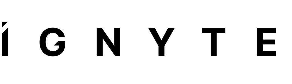
Primary Brandmark - Rollover and click to download logo pack
Brand Use
Files are available for download, please see download and sharing functionality available on some of the elements contained on this page.
Brandmark Versions
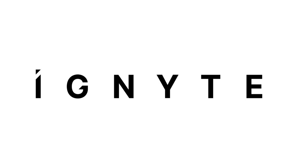
The following are the brandmarks for the Ignyte brand.
The brandmark can only be used in black or white. No other colours are permissible.
Brandmarks should never be modified. Please follow the minimum clear space rules.
The two formats are;
Primary brandmark – full name of the brand. Used across all brand, marketing and communications.
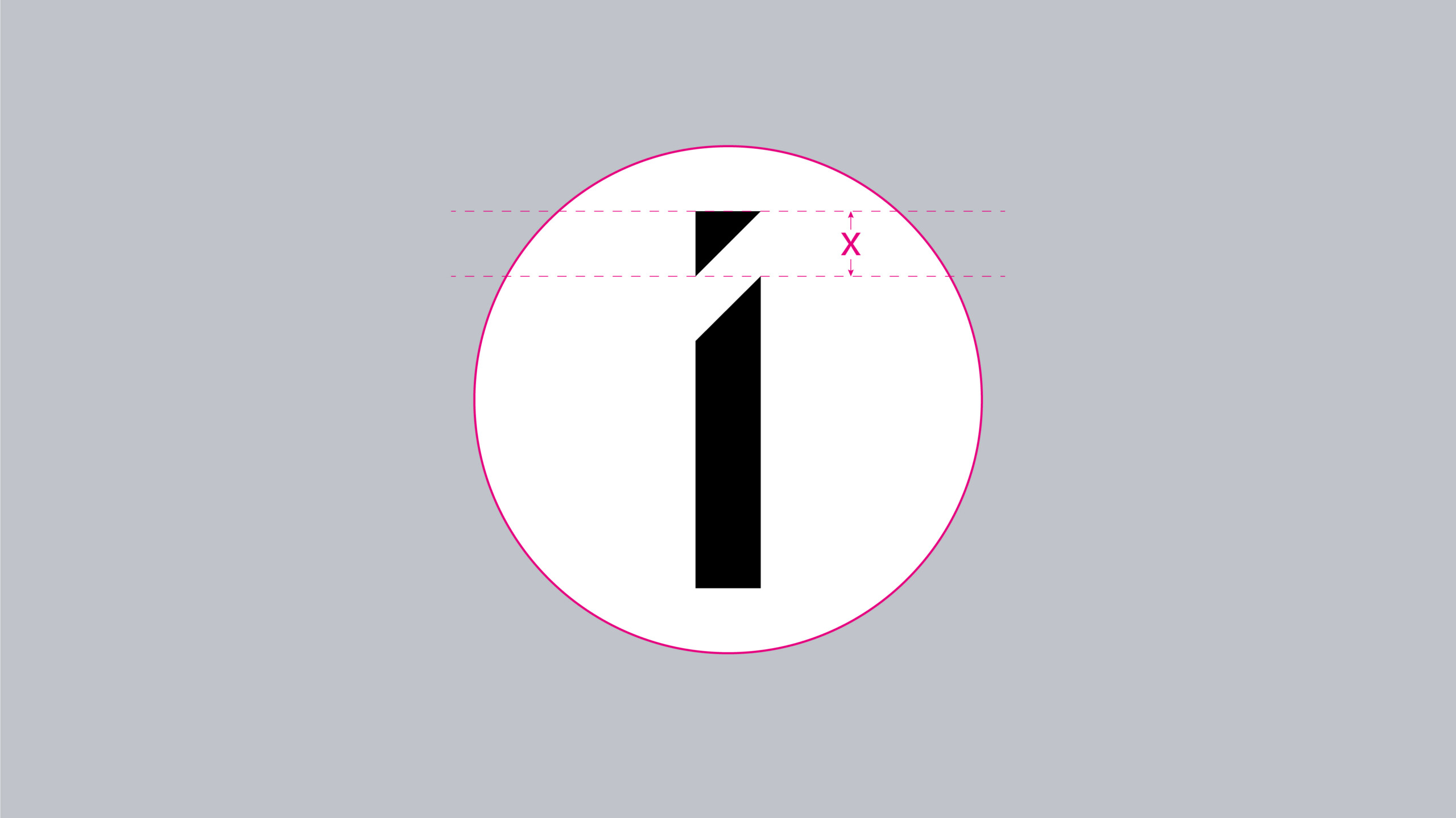
Icon – the ‘I’ of the full brandmark. Used for applications such as the favicon, social media profiles or application with minimal size for branding, such as merchandising.
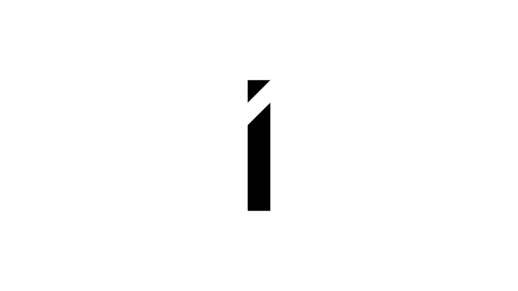
Icon - Rollover and click to download logo pack
Usage Rules
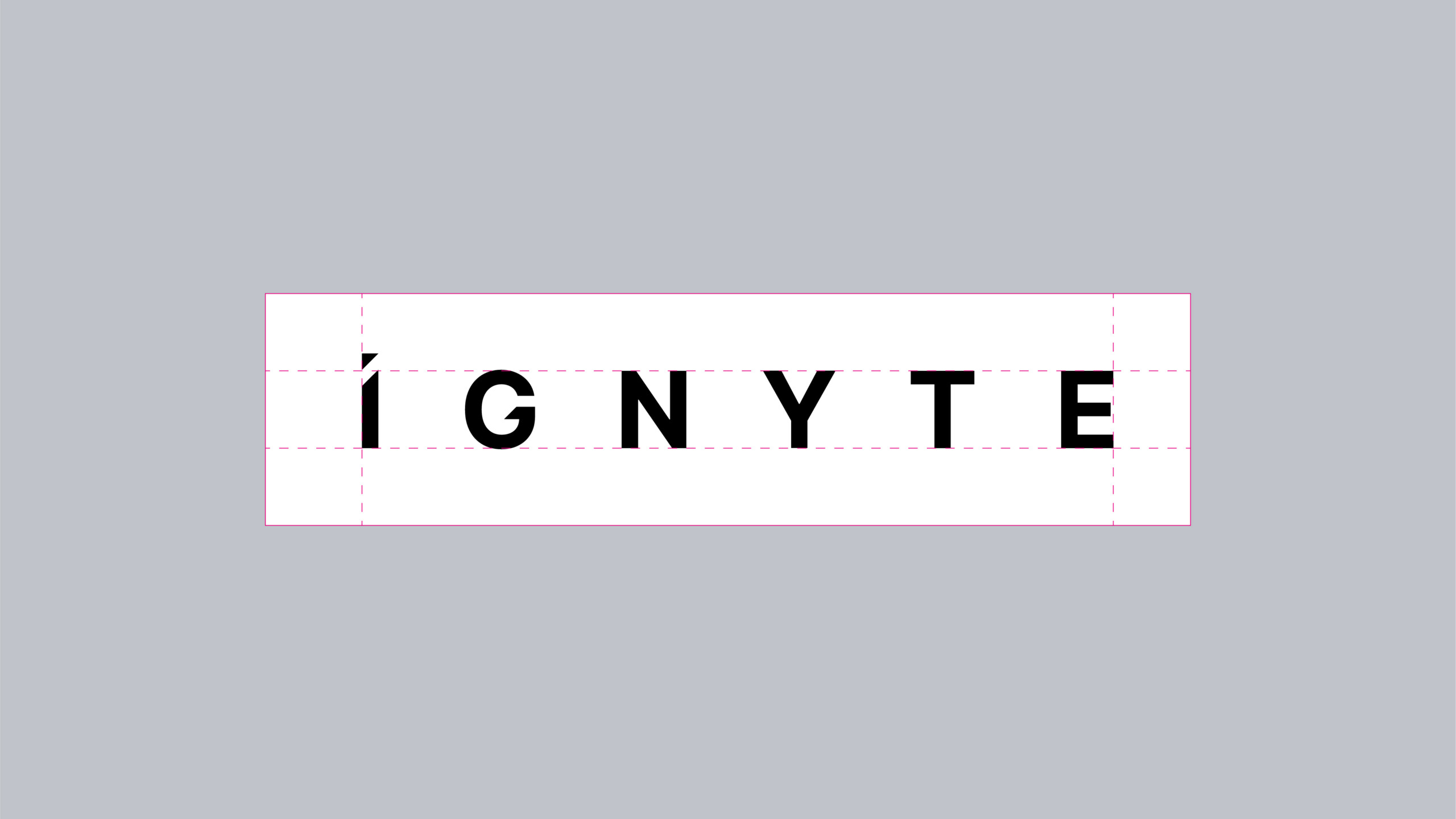
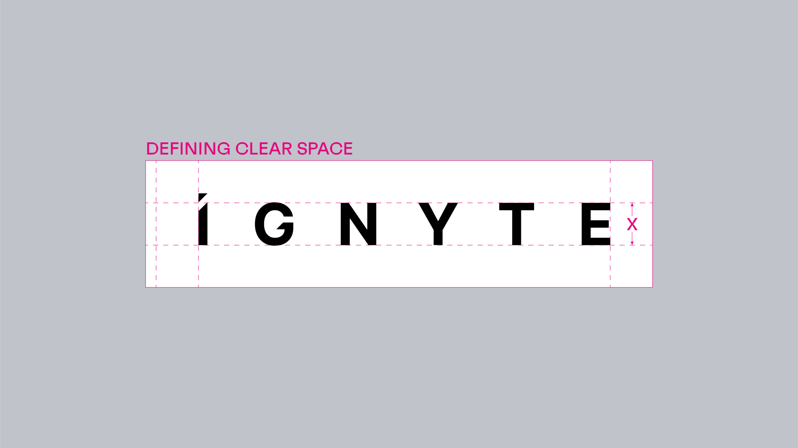
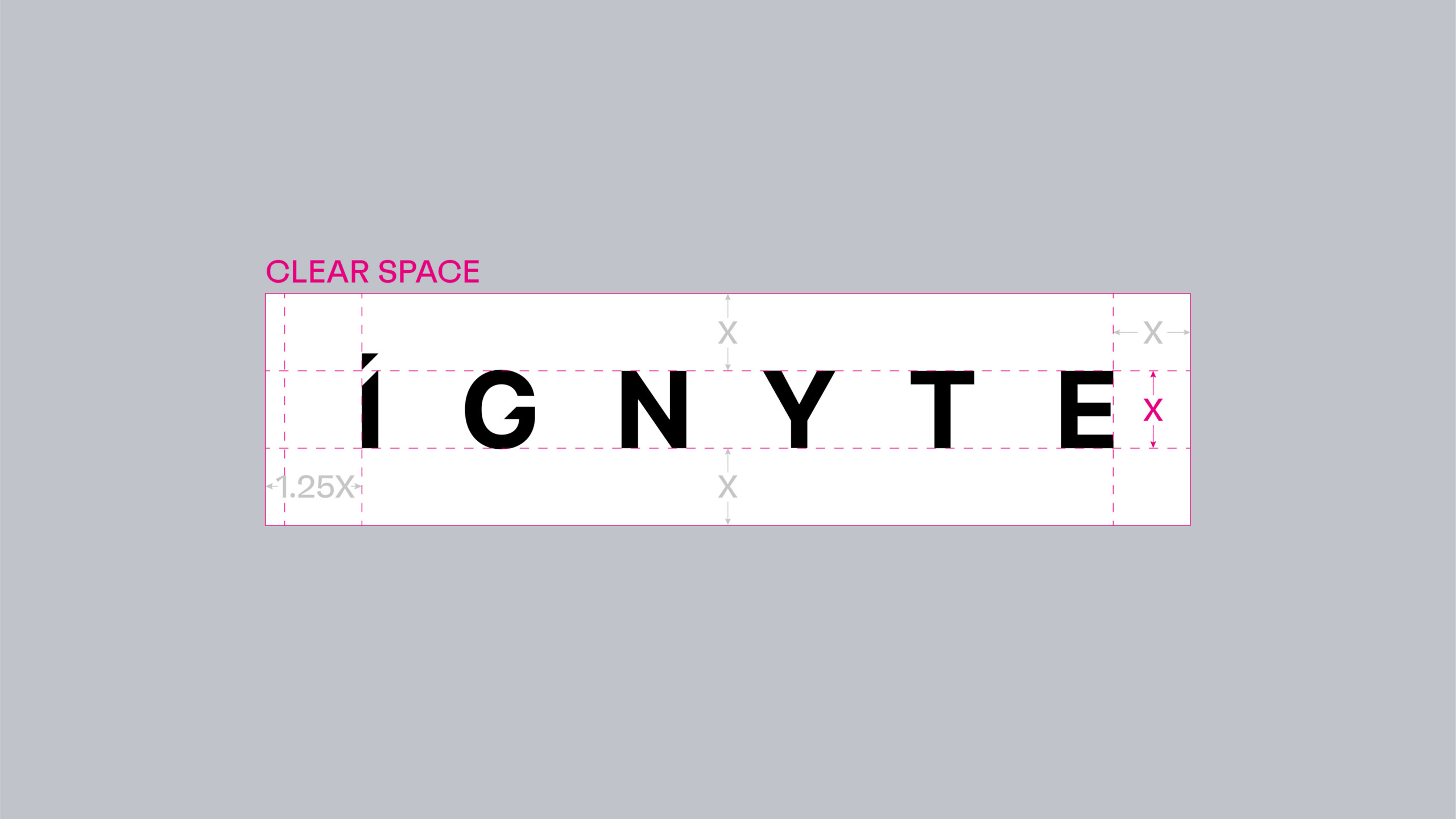
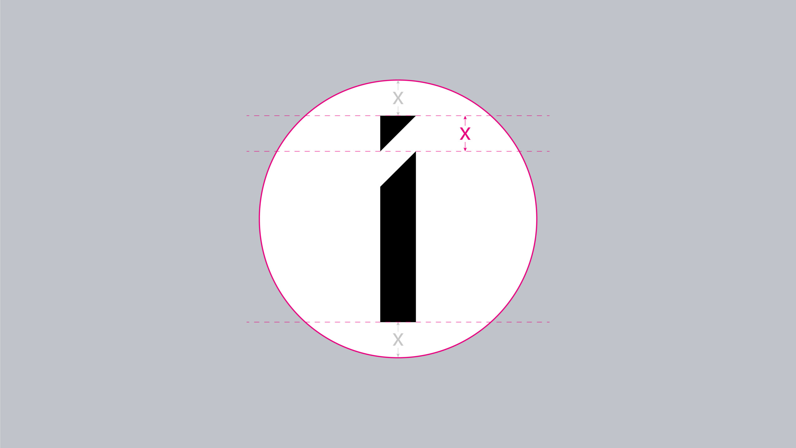
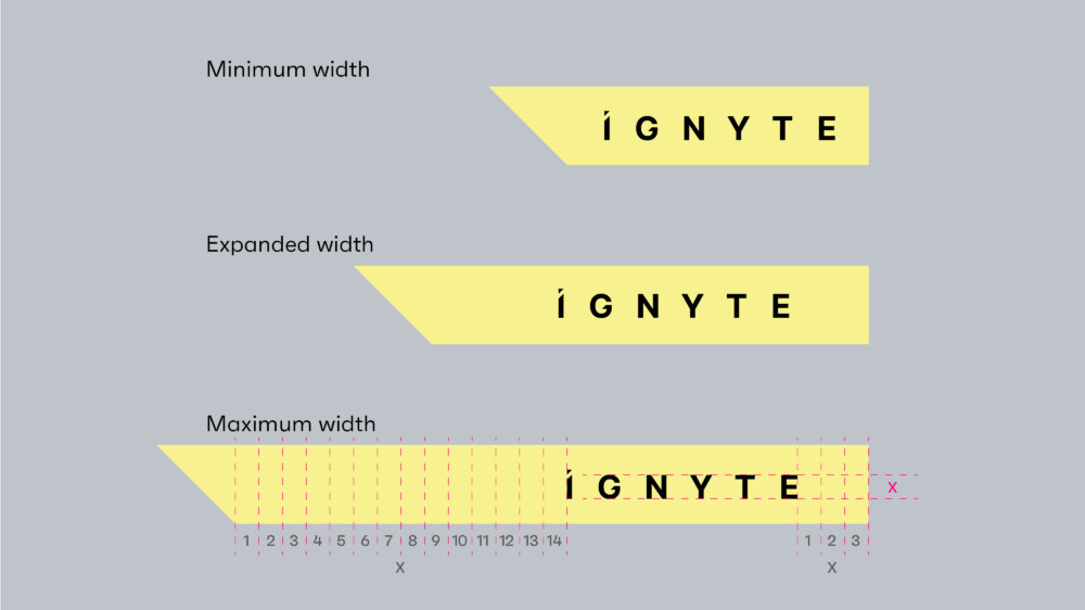
Clear Space
Clear space is equal to the x-height of the Ignyte brandmark and the icon as shown.
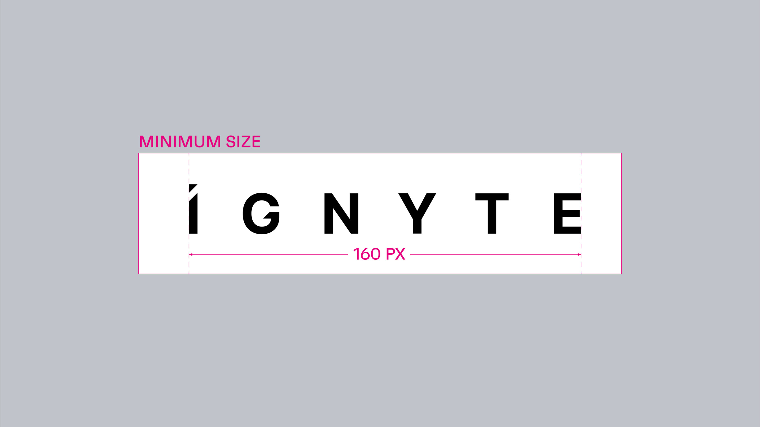
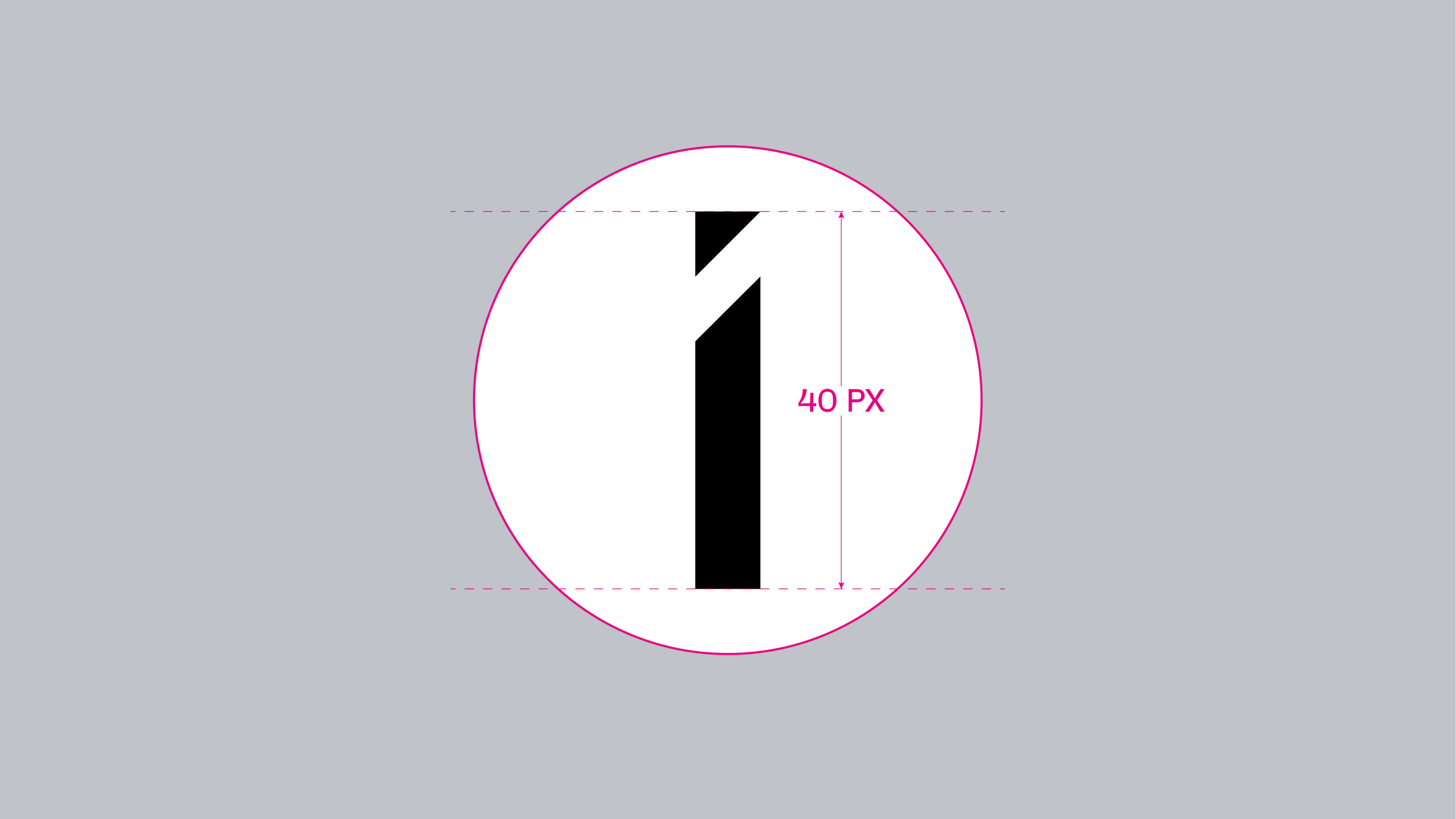
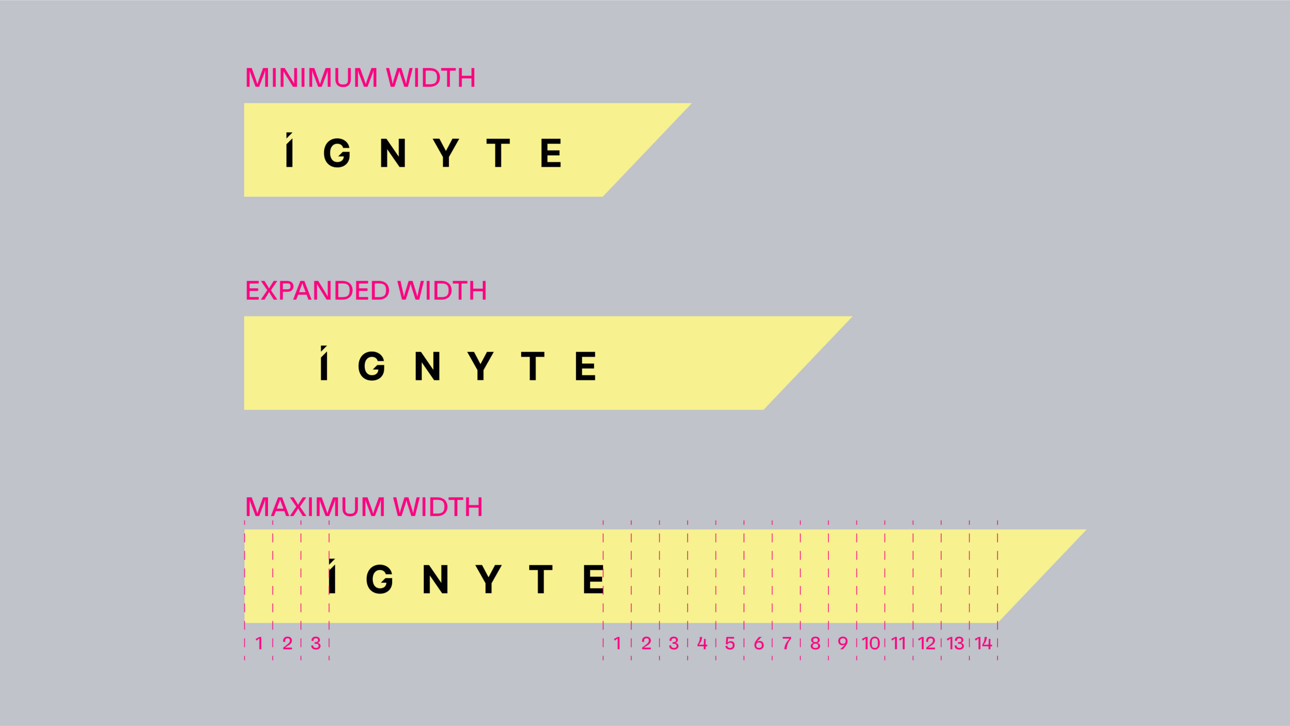
Minimum Size
The minimum size rules should be adhered to strictly. This will ensure the Ignyte brandmark and icon are always legible across all applications. Visuals are not shown to scale.
Colour Versions
There are two colour variants of the brandmark:
Primary: Graphite Black
Secondary: Glass White (Reversed out)
The preference is to use the technology black against the grey or light backgrounds. Glass white should only be used when it is required to reverse the brandmark out of a dark coloured background.
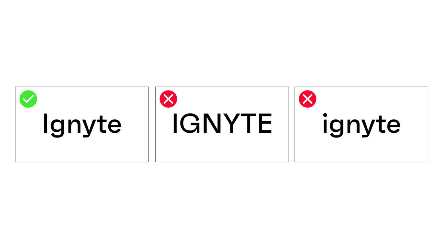
Our name
It is important to remember that even though the Ignyte brandmark is in uppercase, it is essential to typeset Ignyte with a capital I, as it is a brand name and not the common verb.
The following are examples of how Ignyte should be written within copy or set in applications.
Graphic Devices
The following is an overview of the graphic devices used in the brand visual language.
These graphic devices are inspired from the detail that features in the ‘I’ of the Ignyte brandmark. This creates a dynamic brand that is agile and adaptable to different content requirements.
Graphic variations:
There are four distinct components available for use.
1. Starlight
2. Velocity Strip (Solo and Multiple)
3. Quadra
These four graphic devices can be used individually or with an image and content. They should never be used together in one layout.
Always begin your design with the artwork files provided, ensuring scaling or extension of the graphics is done in accordance with examples shown to maintain brand consistency.


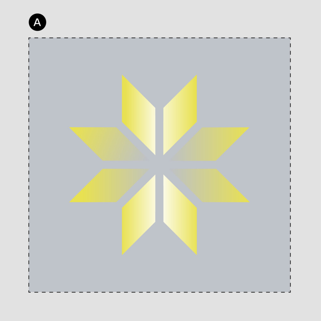
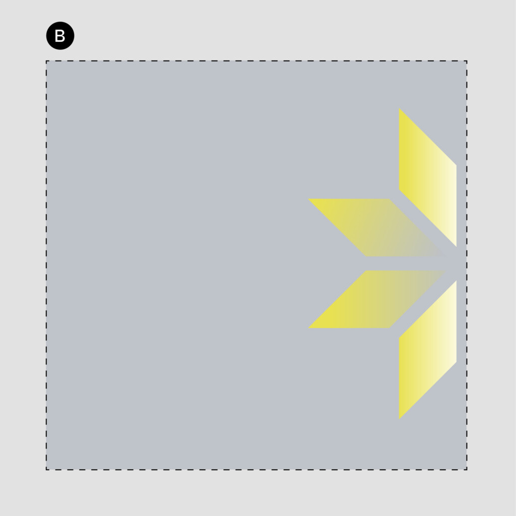
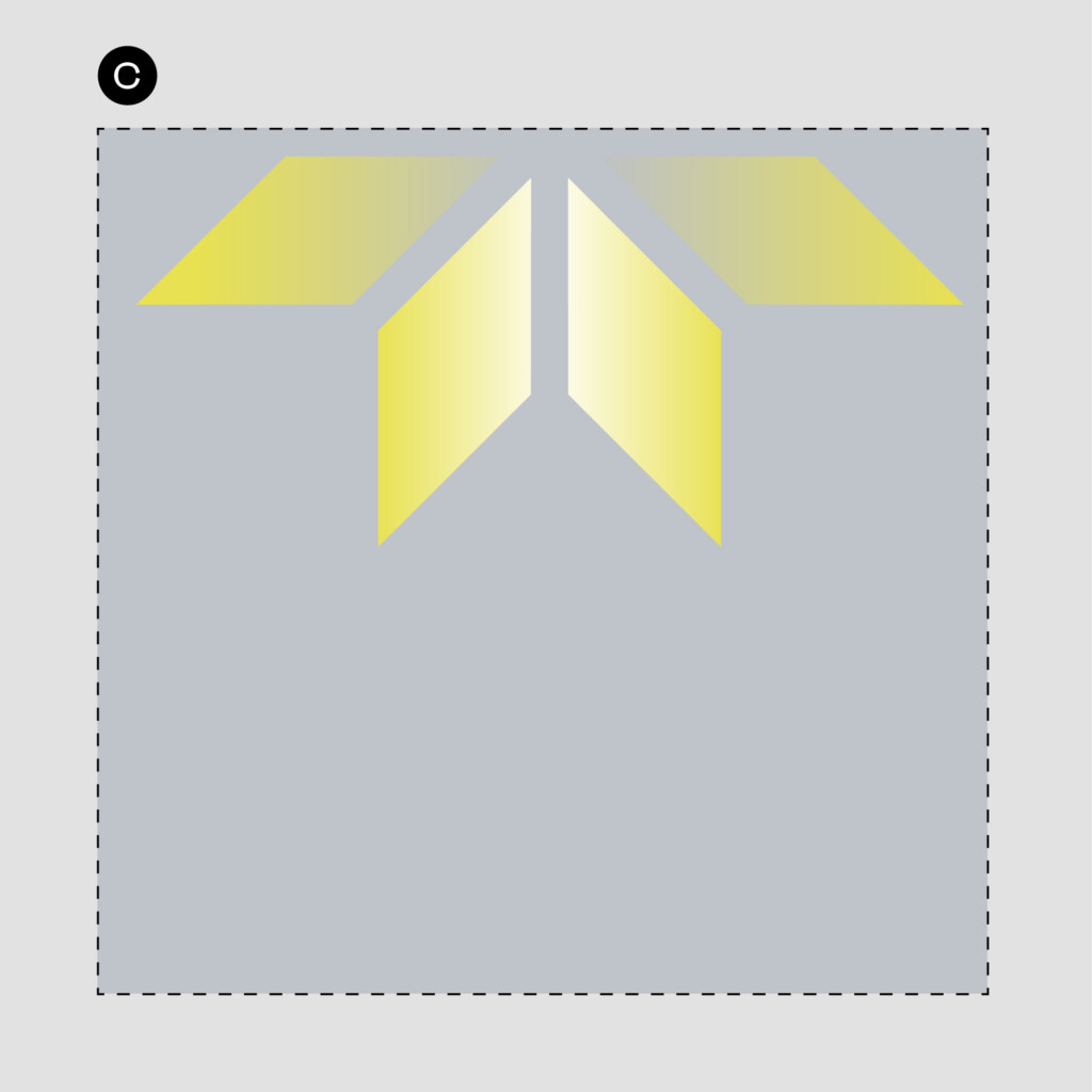
Graphic Devices: Starlight
Starlight
The Ignyte Starlight is the primary graphic device that is utilised throughout the primary touchpoint of the brand. It is derived from the I of the Ignyte brandmark – taking the triangular form and extending it outwards, dynamic, and ever changing system representing the future and optimism.
Below are some examples of how the Starlight graphic device can be cropped.
Usage Rules
A. Full Starlight graphic device can be used as a stand alone graphic or behind the brandmark, typography or images.
B & C. Crops of the Starlight graphic on any edge of the layout – showing 4 of the star facets – and can be used as a standalone graphic or behind the brandmark, typography or images.
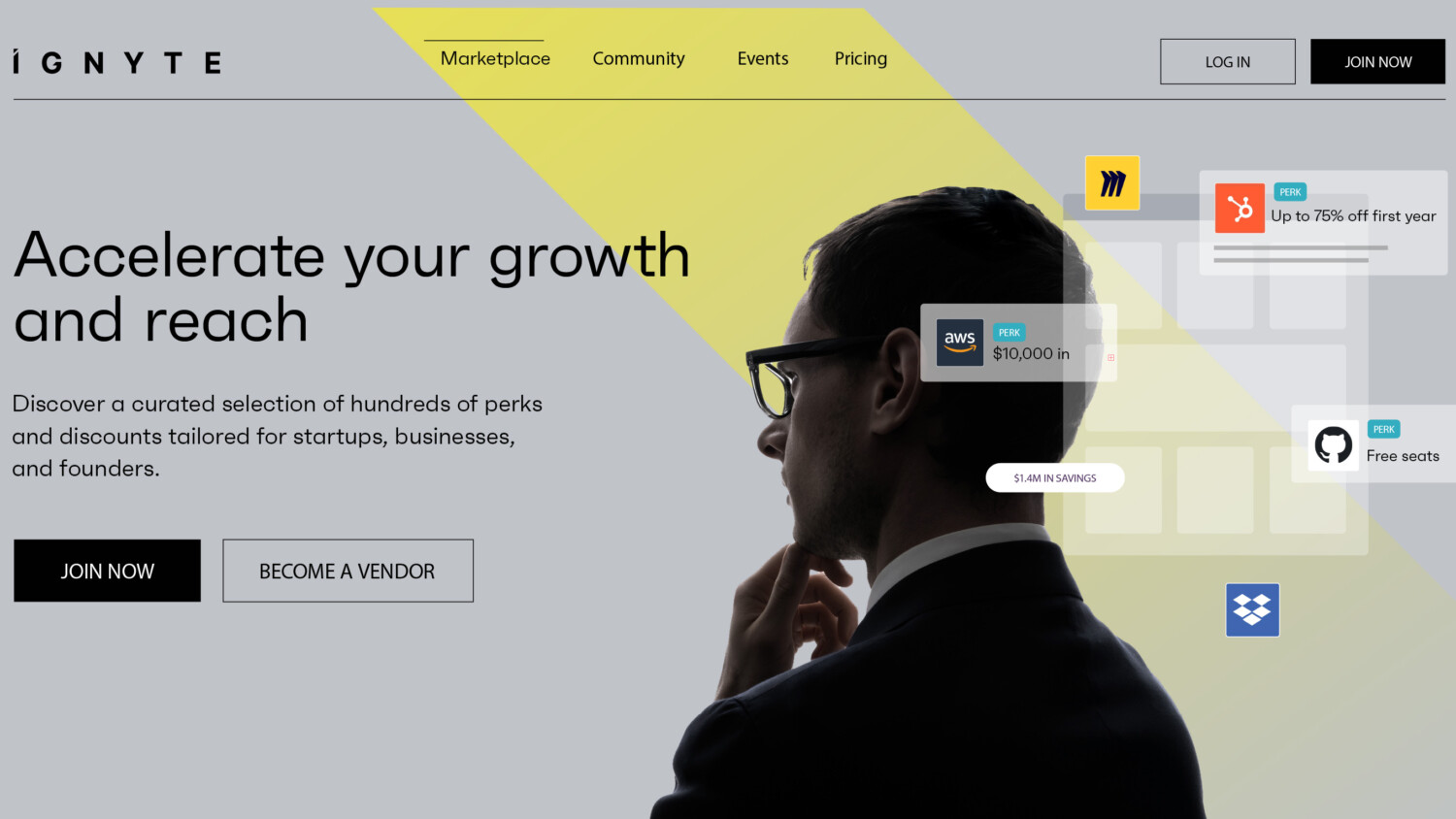
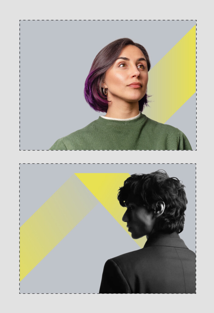
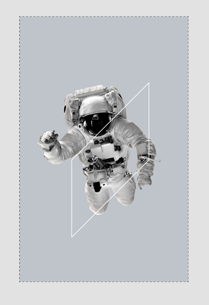
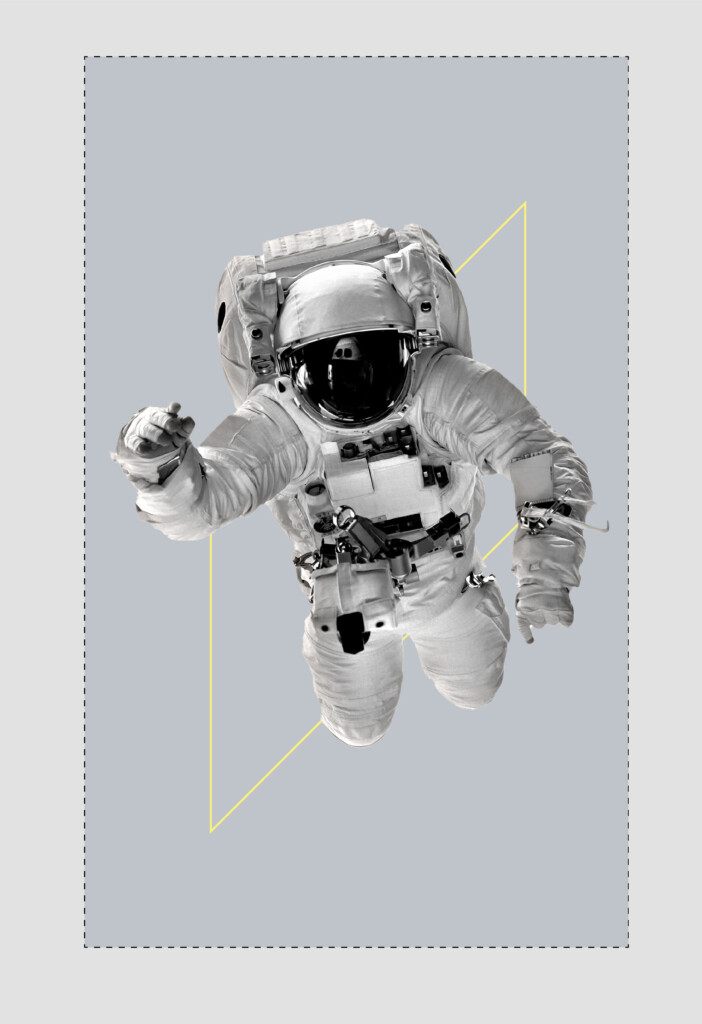
Graphic Devices: Velocity Strip (solo & multiple)
The Velocity Strip is a secondary device designed to be used in conjunction with people photography or inspiring objects or products related imagery.
The Velocity Strip is derived from the Starlight graphic device – it is a single facet of the star expanded along its diagonal.
The Velocity Strip represents the idea of energy and movement, ideas and business moving at speed.
Usage Rules
The following are a selection of examples of how the Velocity Strip can be rotated and positioned.
The Velocity Strip can be shifted along the entire length of the canvas, but always interacts with the subject of the layout (person or object) as demonstrated below.
No more than a combination of two Velocity Strips should be used on a single layout, page or screen.
Always use the primary brand palette of Ignyte Yellow.
Always use in combination with the Technology Grey background.
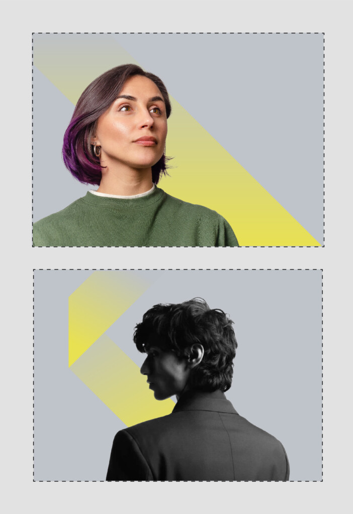
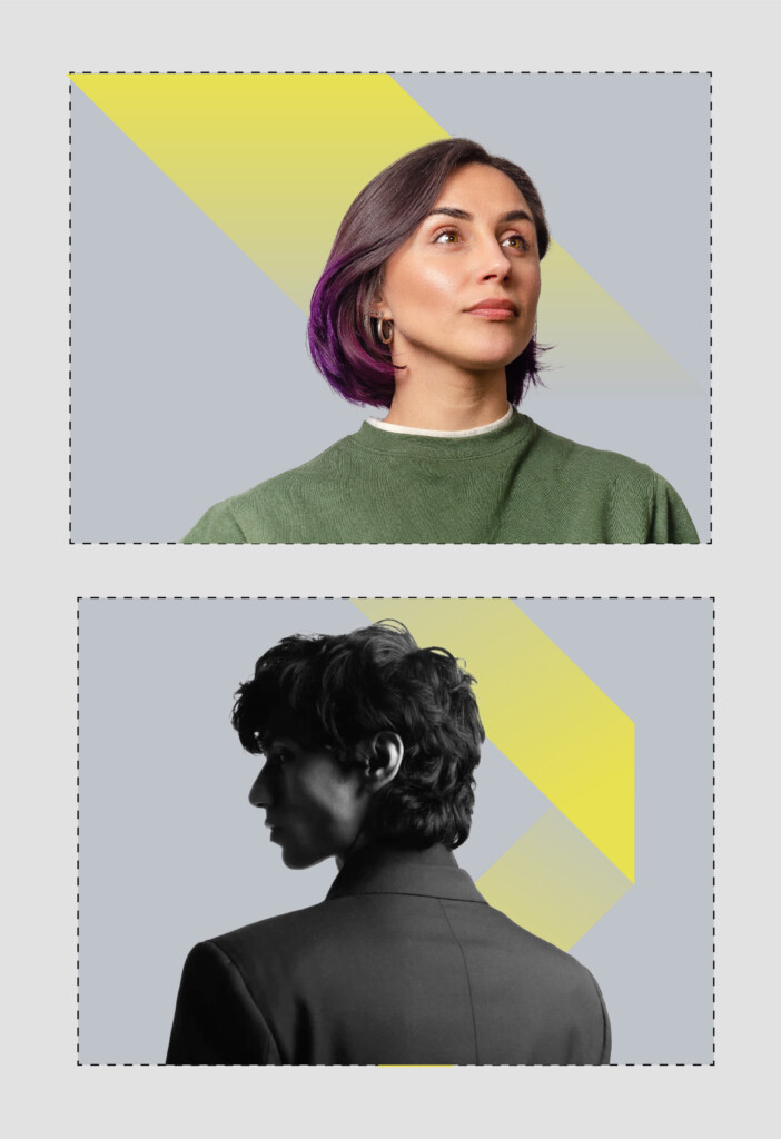
Graphic Devices: Quadra
The Quadra is a secondary device that can be implemented to aid communication and add a depth to visual design system through the framing of a subject matter, portrait photography or a typographic idea.
Below are some examples of how the Quadra device can be implemented.
Usage Rules
- The primary colour palette should be used when using the Quadra.
- The Quadra can be implemented in any of the brand colours but this should be done with restraint.
- The Quadra can be used both in the foreground or background as required.
- There are no sizing limits however, the device should frame the subject matter in a cohesive manner.
- Do not rotate the device – always ensuring the right side of the frame is elevated.
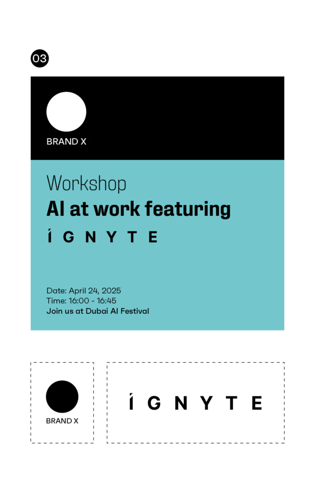
Holding Device
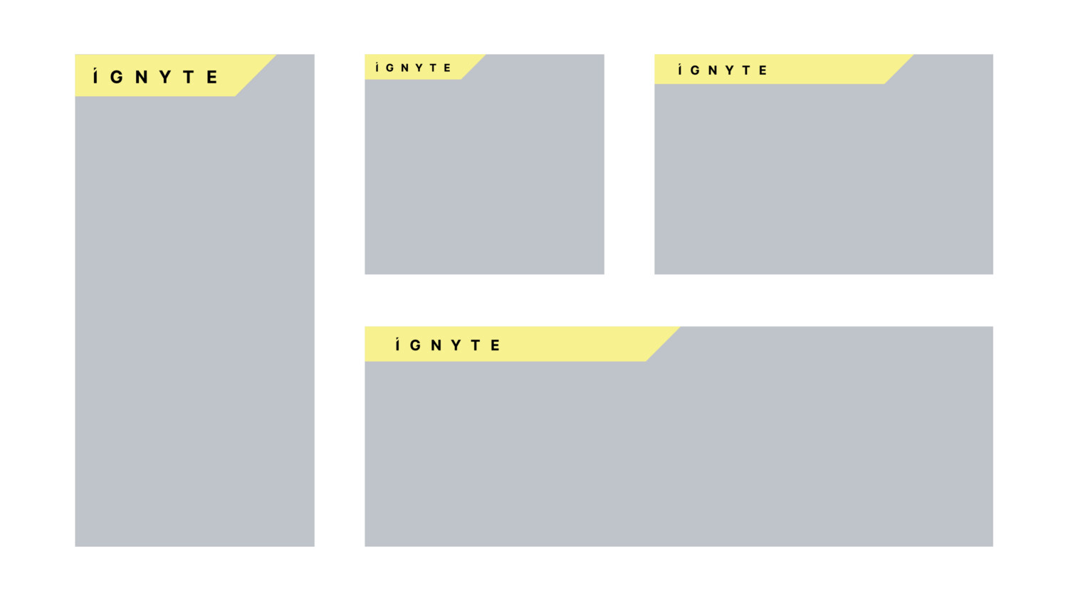
Brandmark holding device
The Ignyte brandmark can be used in conjunction with this holding device. The holding device is an optional component of the brand and purely exists when the brandmark requires elevating in terms of prominence across communications or marketing material or when the background, such as an image, reduces the legibility of the brandmark.
Below are a few examples of how the brand holding device can work across different media formats.
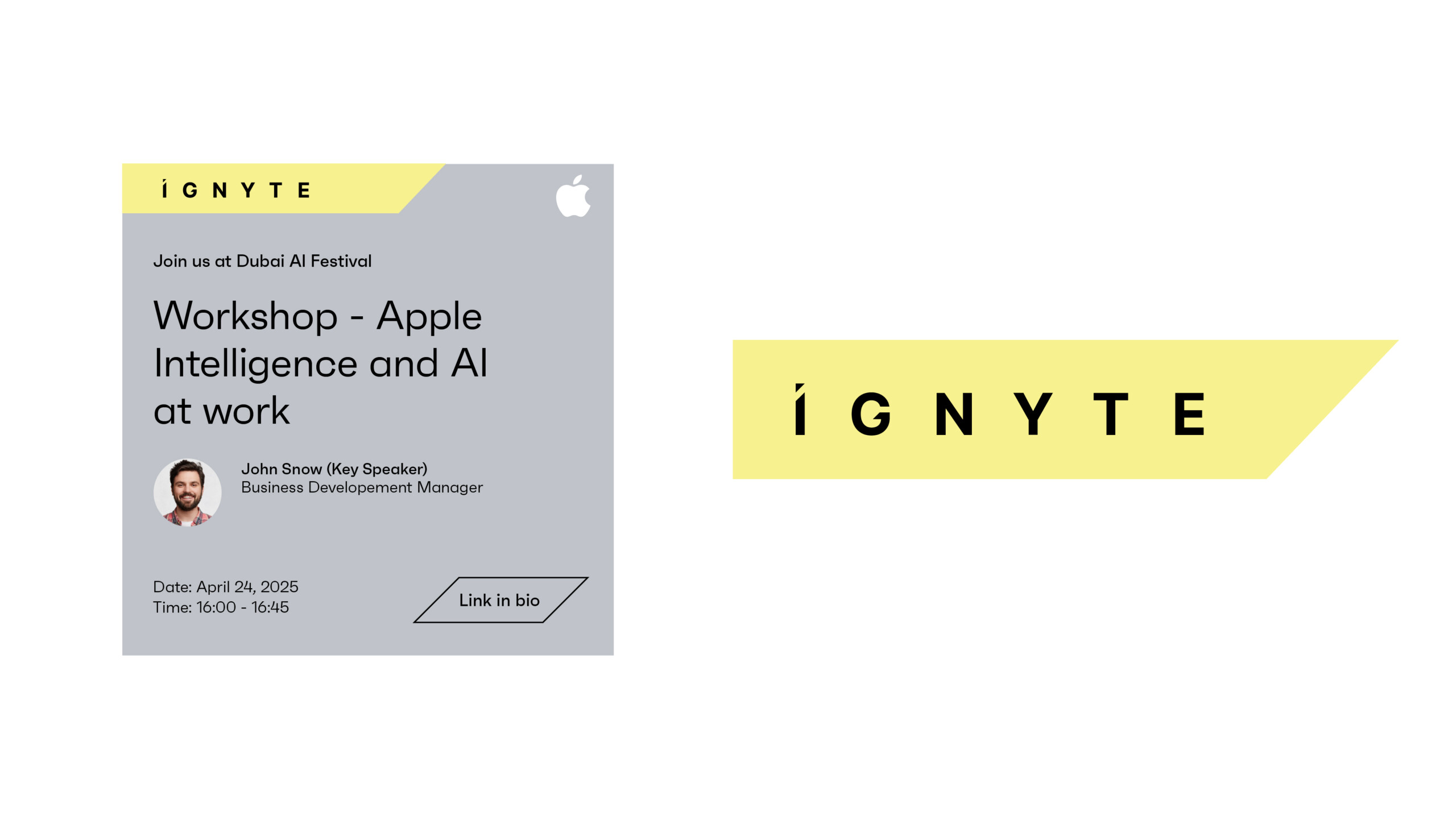
Usage Rules
1. The holding device should only be used in conjunction with the brandmark.
2. The holding device should never be more than 80% of the total width of any layout or format.
3. The holding device should not be shorter than 30% of the total width of any canvas.
4. The holding device should only be used horizontally.
5. The positioning of the brand within the device should follow the clear space rules as shown above.
6. The colour should always be retained in Sunset Yellow.
7. The holding device should always lock up with the top left corner.
8. Same rules apply when doing a right aligned layout (only for language or specific applications requirements, such visibility obstruction at events).
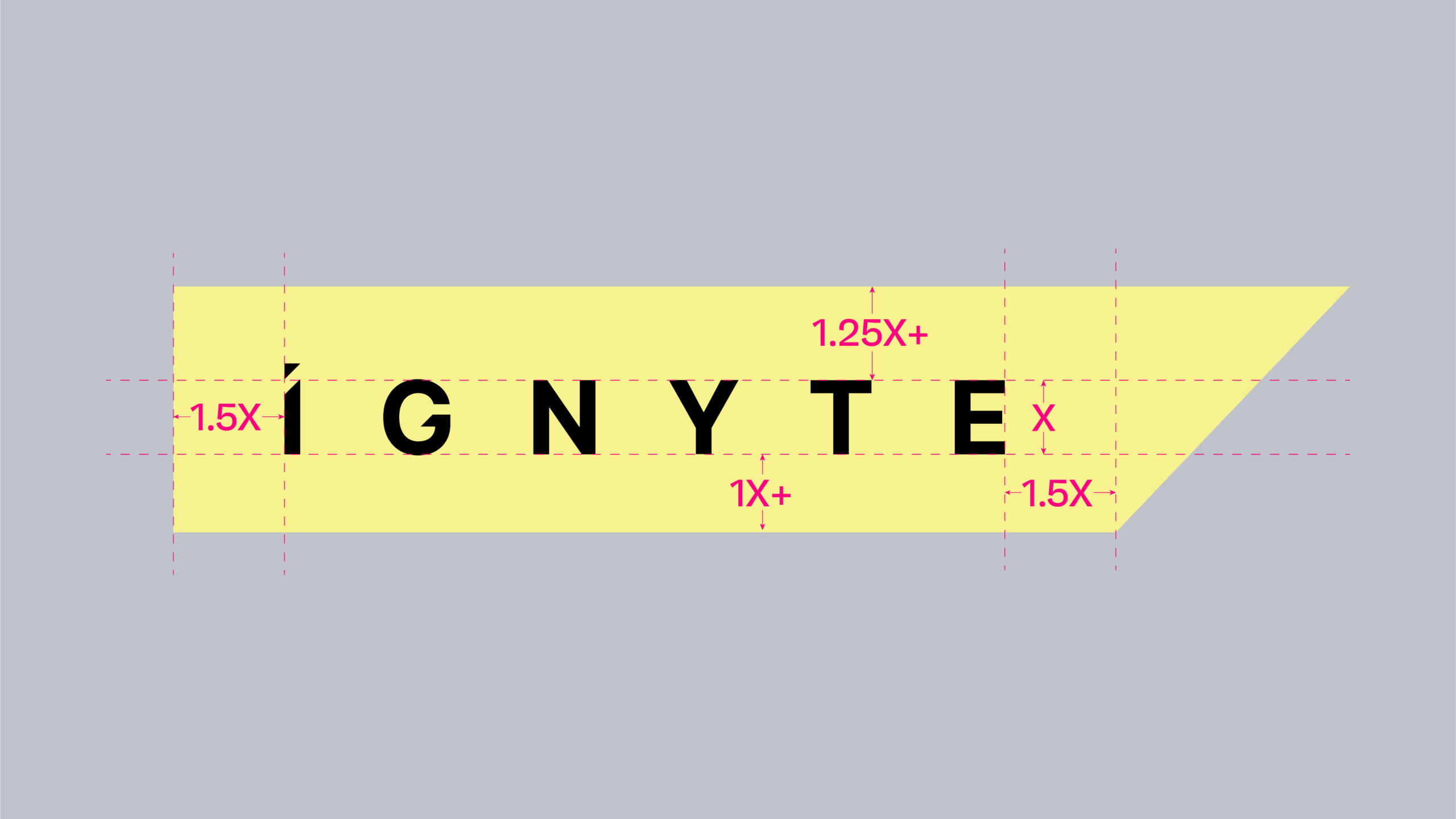
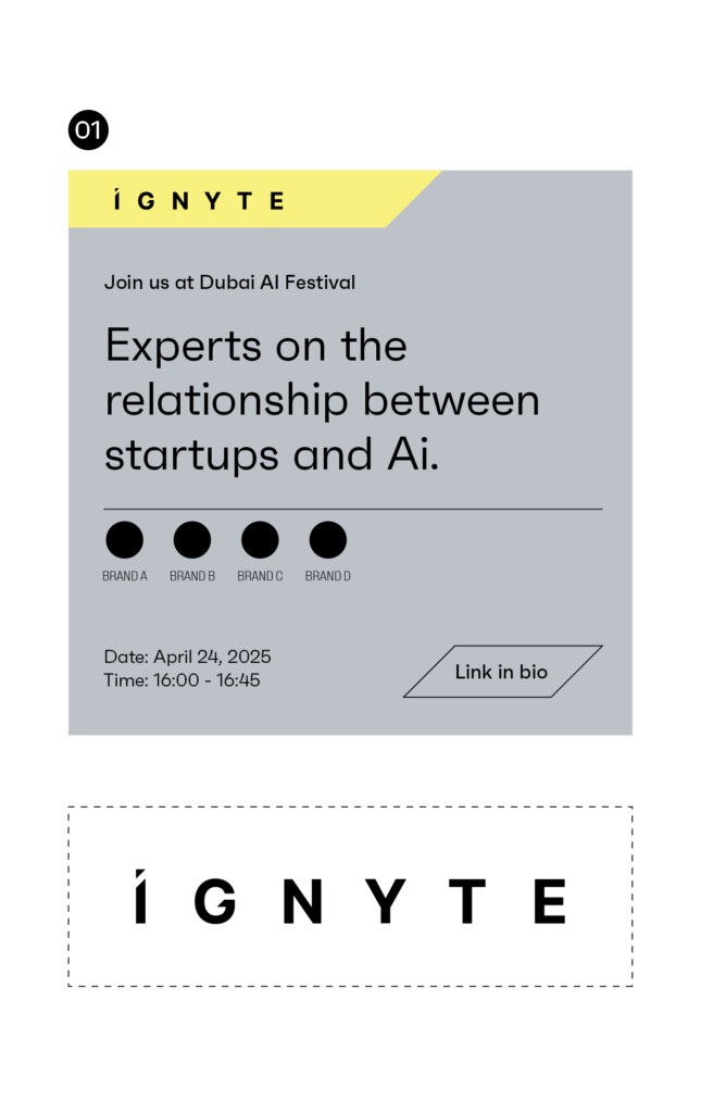
Content holding device
The content holding device is a graphic component that acts as a device to hold key information or draw attention or highlight a specific item within marketing material and communication.
This is a tertiary component and should be used sparingly.
Examples of its use can vary from holding the URL, a call to action message, a date or time, VIP persons name, or another similar type of information.
Click here to download the Content holding device artwork file.
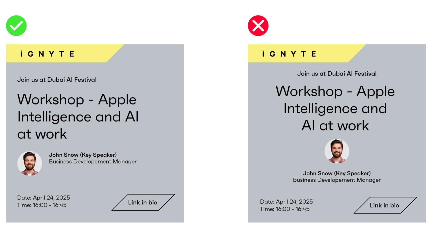
Usage Rules
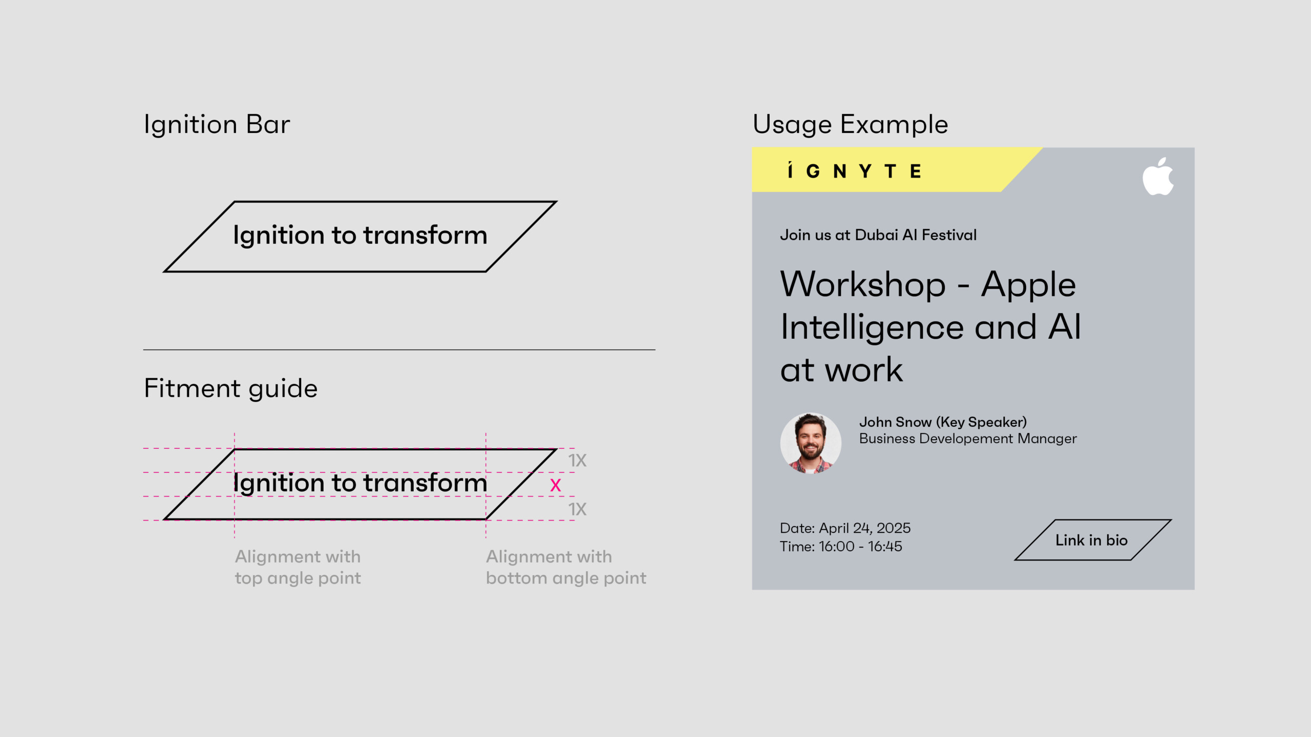
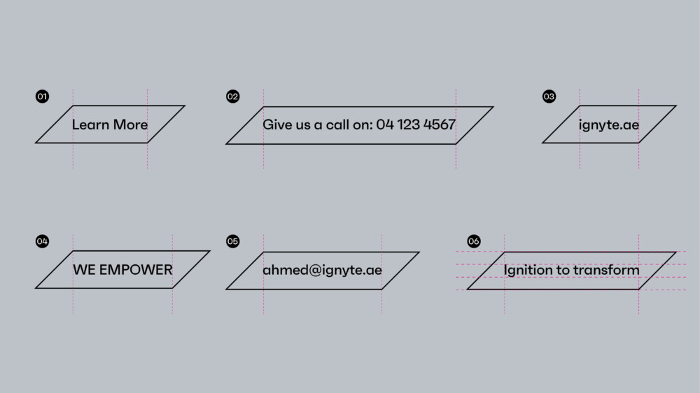
- Copy should only be limited to a single line of information.
- Copy should be vertically in the middle of the Ignition Bar.
- Spacing above and below the copy should be equal to that of the cap-height of the type – shown using “x” in the visual guide below.
- The Ignition Bar should be lengthened or shortened so the top left, and bottom right corners – align with the first and last letter of any text.
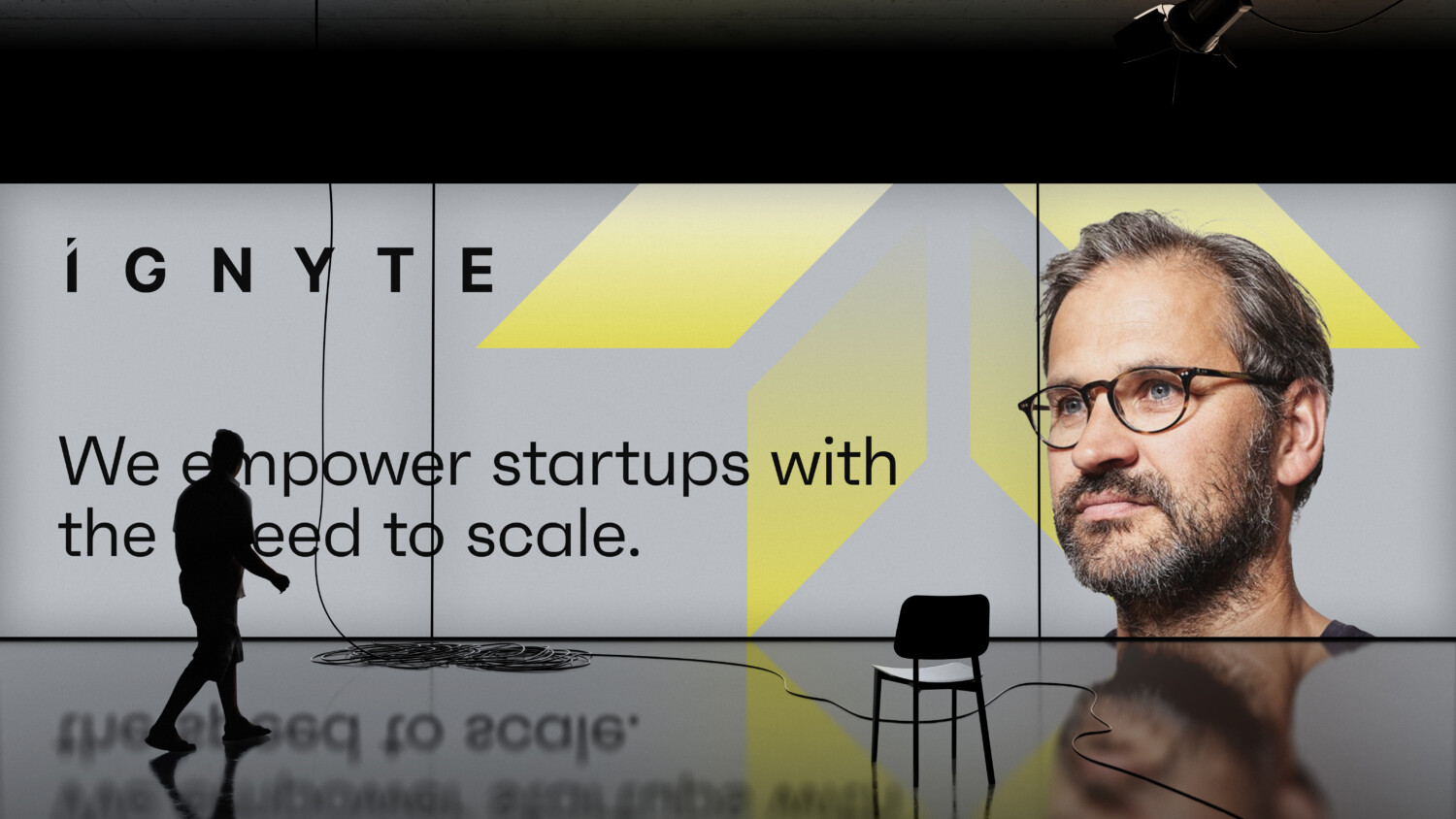
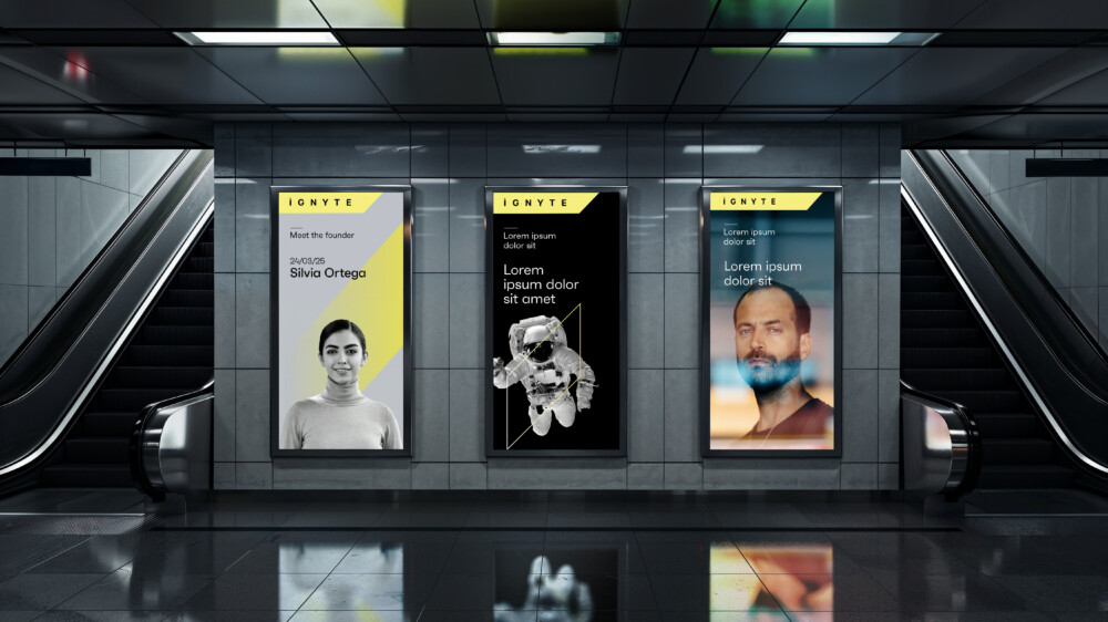
Brand Imagery
People
The Ignyte brand photography focuses on featuring the visionary people who transform ambitious ideas into exponential success.
The images can be used in conjunction with typography, brandmark, or additional graphic components, to both communicate a concept or purely act as a visual identifier for the brand.
It is important to ensure these images act as a component of the overall visual language system.
Portraits should always be used on the Ignyte grey background. When shooting people at events or for content related applications then the background should be out of focus.


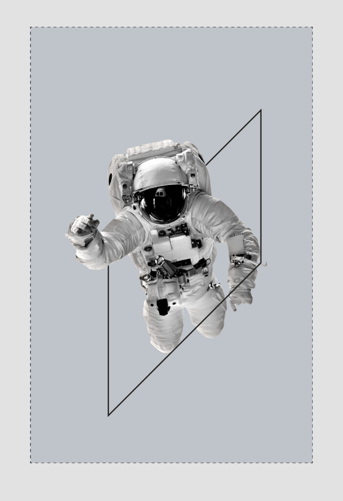
Abstract and emotive
In addition to portraits, the Ignyte brand incorporates the essence of the brand through dynamic and emotive imagery that represents new frontiers and the power of visionary ideas. The space industry acts as a metaphor for the ambitious dreams and entrepreneurial spirit ignited to achieve greatness.
The following images are examples of imagery that supports the brand personality.


Co-Branding
The following are the basic principles when utilising the Ignyte brand together with partner brands.
There are three scenarios that the brand might encounter when being used with external brands.
- Ignyte as the primary brand with partner brands playing a secondary role.
- Ignyte brand with equal weighting with a partner brand.
- The Ignyte brand featured in communications of another brand.
These principles apply to all brand executions, across events, digital applications and marketing comms.
Primary brandmark should be used when the Ignyte brand is featuring external brands. The external brands should play a secondary role in terms of size and hierarchy across comms that feature external brands.
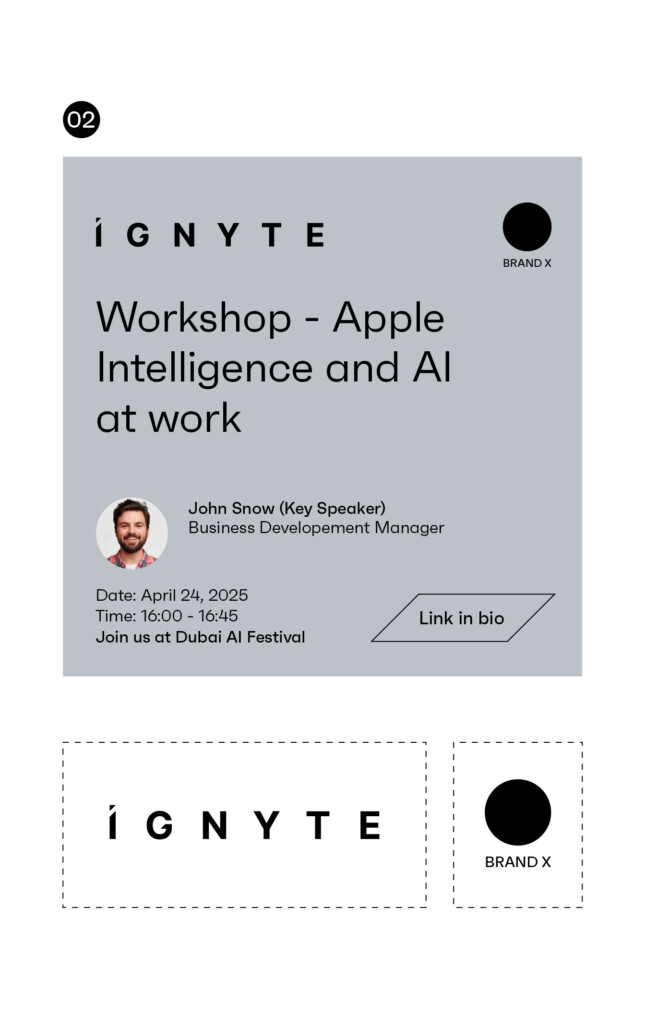
When partner brands are used with equal weighting, the Ignyte brandmark should be matching the size and hierarchy of the partner brands.
When we are appearing on partner led communications we would ask that the layout is left aligned and that the Ignyte brandmark adheres to all clear space and minimum size rules. The brandmark should appear black on lighter colours and white reversed out on darker colours.
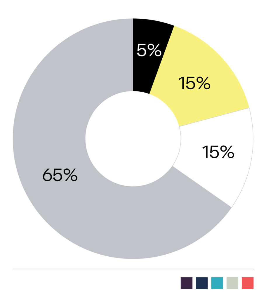
Colour Palette
The following is the brand colour palette for Ignyte and a guide to the ratio of colours that can be used across brand application. The ratios should be followed closely on each layout to maintain the personality of the brand.
The primary colour palette should always be used. Its consistent use will drive brand recognition.
The secondary colours are for highlighting or differentiating of information, such as presentations, websites and UI Â and UX.
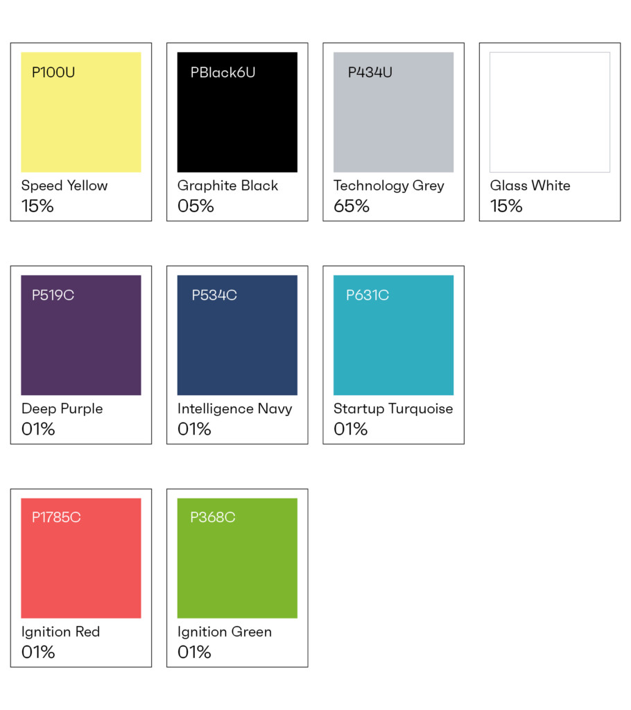
Primary Palette
Graphite Black
#0a0a0a
R 000. G 000. B 000
C 75. M 68. Y 67. K 90
Pantone Black U
Ignyte Yellow
#fef27f
R 254. G 242. B 127
C 02. M 00. Y 62. K 00
Pantone 100 U
Technology Grey
#bfc3c9
R 191. G 195. B 201.
C 25. M 18. Y 15. K 00
Pantone 434 U
Glass White
#ffffff
R 255. G 255. B 255.
C 00. M 00. Y 00. K 00
N/A
Stone Grey
#bfcacc
C 30. M 18. Y 15. K 03
Pantone 428 C
Supporting Palette
Deep Purple
#523563
82.53.99
C 90. M 68. Y 00. K 00
Pantone 2726 C
Intelligence Navy
#2b446d
43.68.109
N/A
Startup Turquoise
#31adc0
49.173.192
N/A
Canvas Sage
#c8d1c2
200.209.194
N/A
Ignition Red
#f25657
242.86.87
N/A
Ignition Green
#7eb72e
126.183.46
N/A
Typography
Typography Alignment
Typography should always be aligned left. This provides structure and ensures consistency across layouts for both digital and print.
Typography
Typography should always be implemented in a clean and structured manner. Particular attention should be given to the weights used for body copy and headlines. The Latin typeface Faktum and the Arabic typeface F37 Bolton Arabic are available in multiple weights, allowing for the building of hierarchy across different types of information – for example in information graphics or illustrating abstract or complex business concepts.
As a general rule, the following weights should be primarily used.
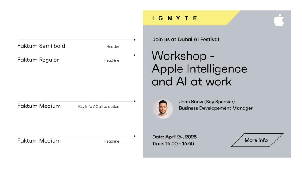
Latin primary – marketing and brand applications
Faktum Light: Body copy
Faktum Regular: Headlines / body copy
Faktum Semibold: Highlights / Key information / Call to action
Faktum Bold: Highlights
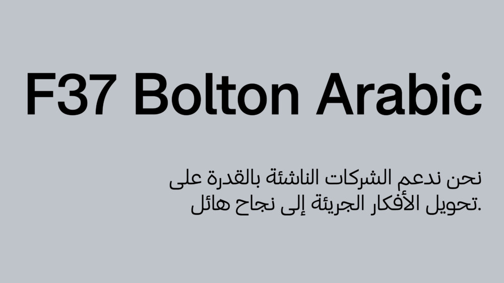
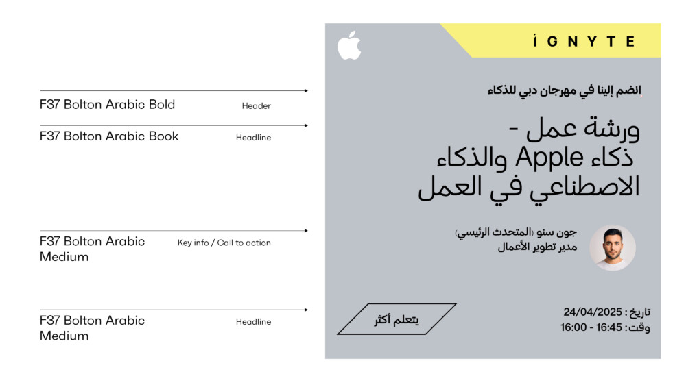
Arabic primary – marketing and brand applications
F37 Bolton Arabic Light: Body copy
F37 Bolton Arabic Regular: Headlines / body copy
F37 Bolton Arabic Semi-Bold: Highlights / Key information / Call to action
F37 Bolton Arabic Bold: Highlights
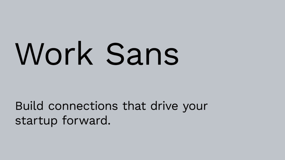
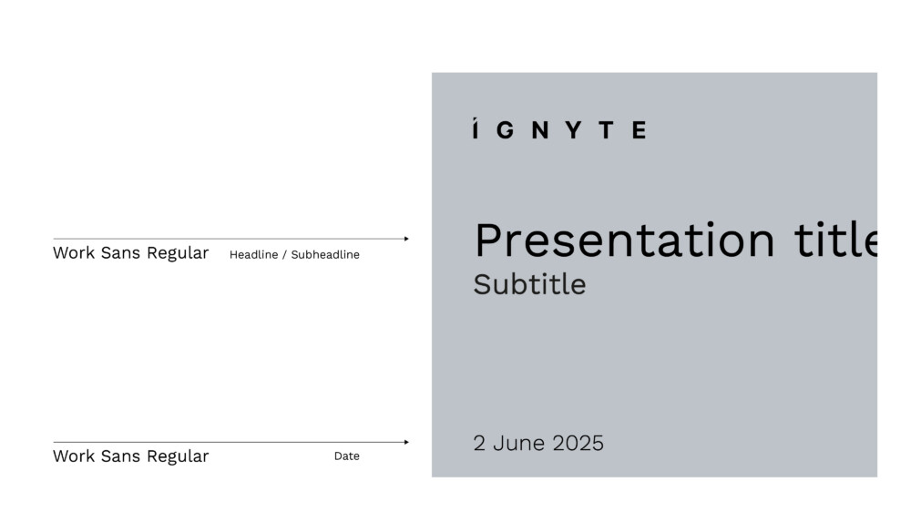
Latin digital – for digital applications such presentations
Work Sans Light: Body copy
Work Sans Regular: Headlines / body copy
Work Sans Semibold: Highlights / Key information / Call to action
Work Sans Bold: Highlights
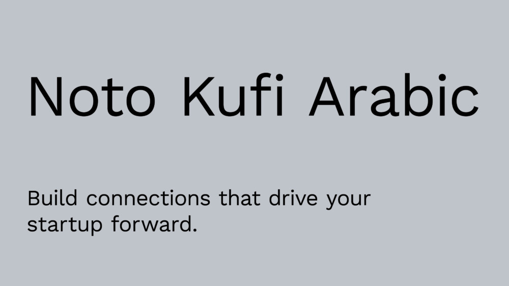
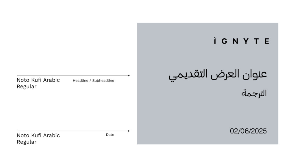
Arabic digital – for digital applications such as presentations
Noto Kufi Arabic Light: Body copy
Noto Kufi Arabic Regular: Headlines / body copy
Noto Kufi Arabic Semi-Bold: Highlights / Key information / Call to action
Noto Kufi Arabic Bold: Highlights
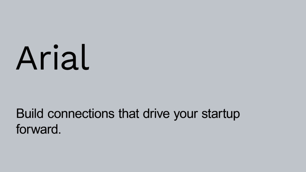
Arabic digital – for digital applications such as presentations
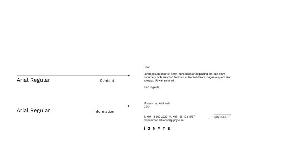
Arial Regular: Headlines / body copy
Arialc Bold: Highlights/headlines
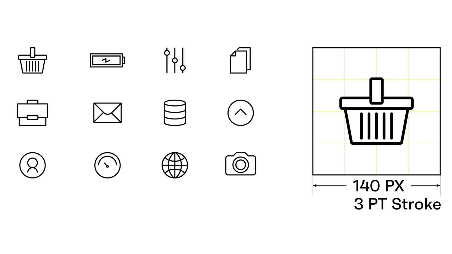
Tertiary Components: Icons
There may be occasions where iconography is required to represent a small component of communication or represent a product feature. These should be used sparingly and not to represent broader brand or product concepts.
Shown here are a small set of icons – indicating the form and style that should be adopted.